Pouring Diluted Flashe Paints
Out of My Comfort Zone: Pouring Flashe Paints, January 2, 2022
I have been trying to pour Flashe paints repeatedly, but today I found the optimal dilution, moved the paint around with a plastic edge, added some diluted sepia ink (acrylic), then LEFT IT ALONE! It has taken all day to dry.
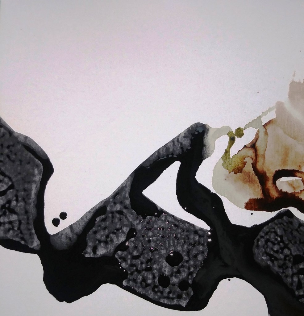
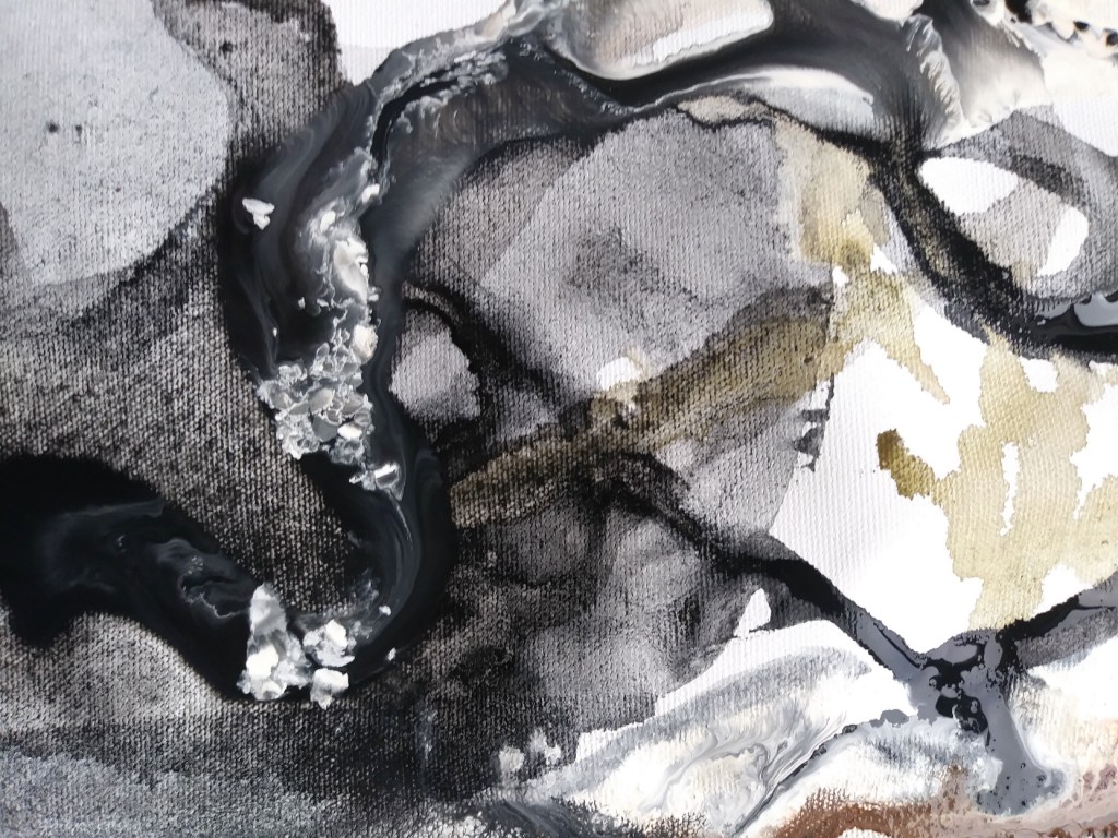
The image on the left will be an abstract background for a realistic bird. I may pour more diluted paint on dry areas to see if it creates a semi-transparent overlay. The image on the right is just experimental pouring on scrap canvas, with some poured white paint forming interesting globules of white.
Flashe Paints are extremely opaque and matte, so it takes alot of dilution (think milk or cream) to get a filmy transparent effect.
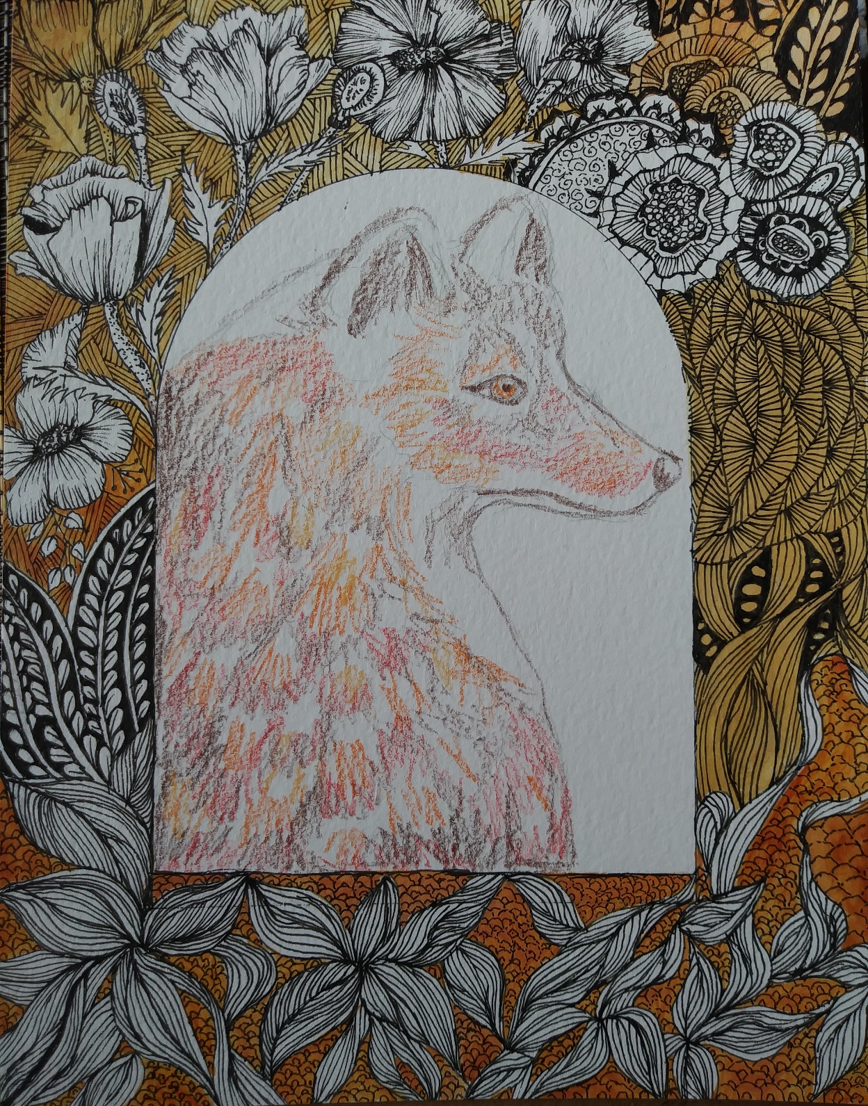
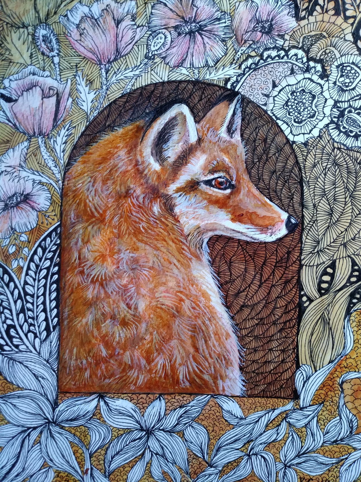
Painting with Watercolour Pencils
December 22, 21
Painting (on paper) is finished with acrylic paint, then coated with acrylic medium(isolation coat) and spray varnished. Works on paper are mounted on cradled wood panel.
- The fox image is drawn in pencil with areas lightly sketched in to mark where colour changes happen. Then watercolour pencil is lightly scribbled to lay down the first layers of colour.
- A wet brush is applied to the dry pencilled areas, taking care to keep brush clean when crossing colour boundaries. Whites of the paper are preserved by avoiding that area. Frisket could also be applied.
- Watercolour pencil looks intense when wetted, but will dry matte and less intense. I then punch up the colours by painting in acrylic, but not completely opaquely, since the watercolour freshness would be lost under a thick layer of acrylic.
- Using a 10/0 fine brush, I add details like eyes and fine markings, fur directional lines, etc.

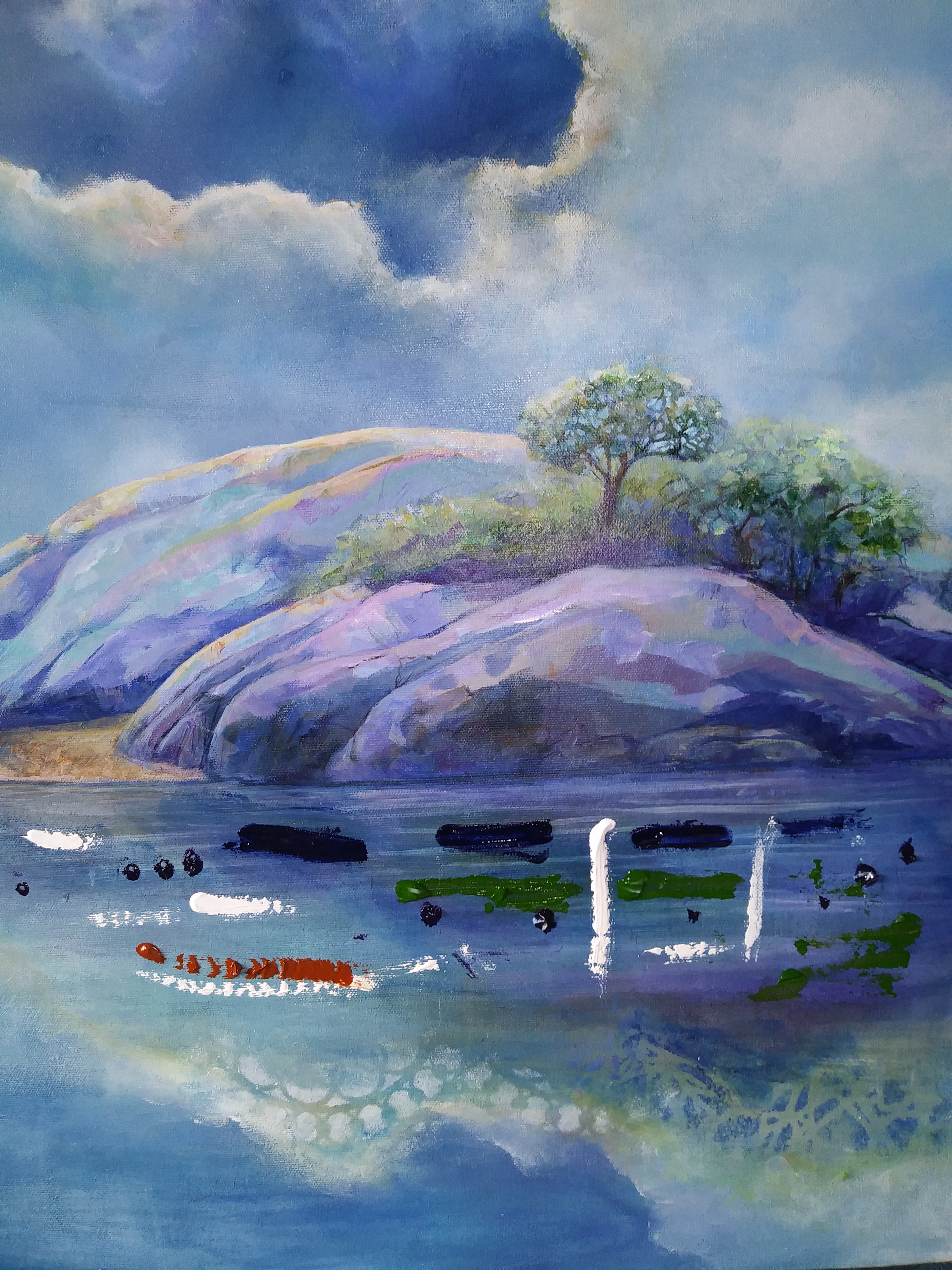
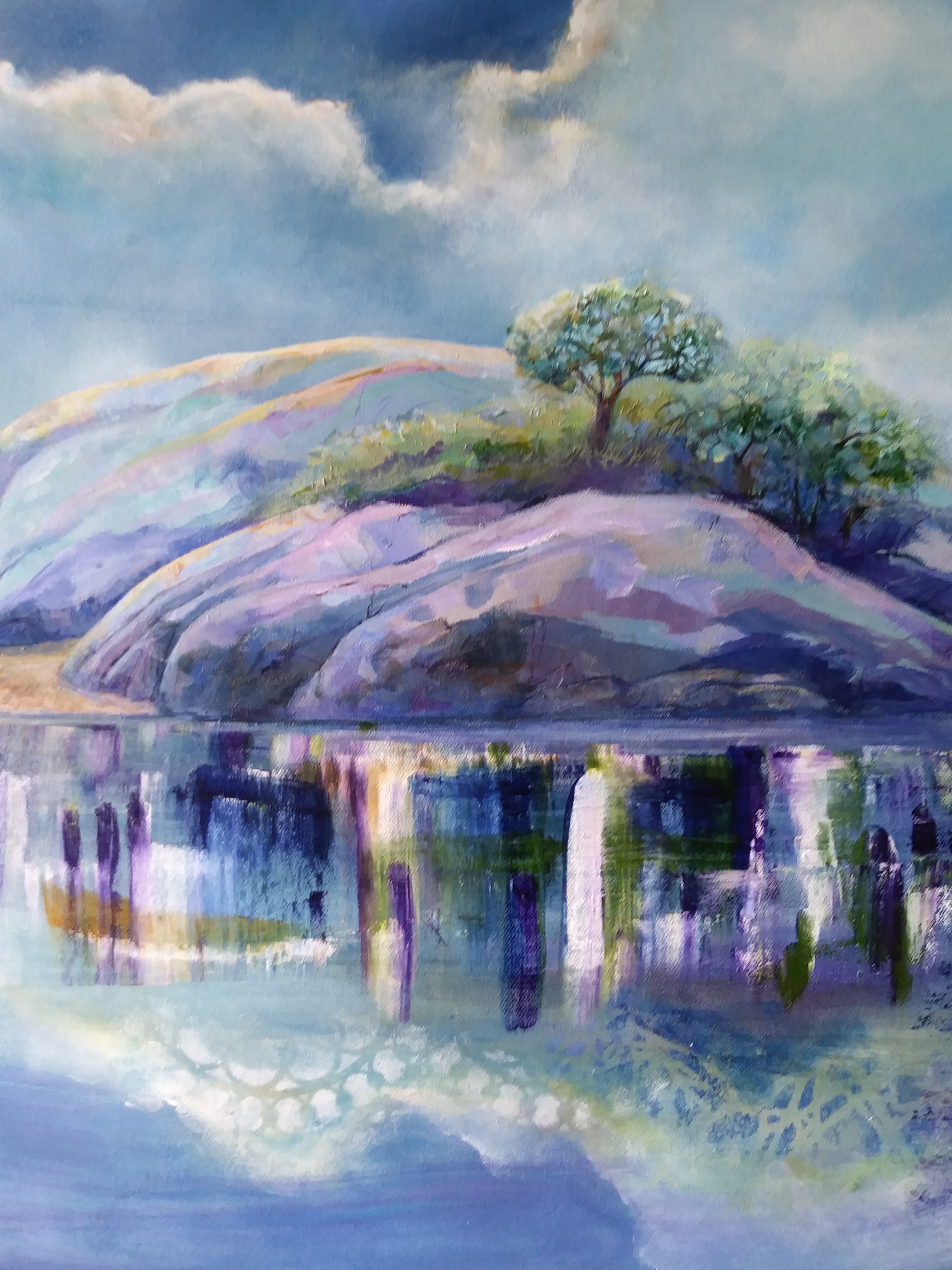
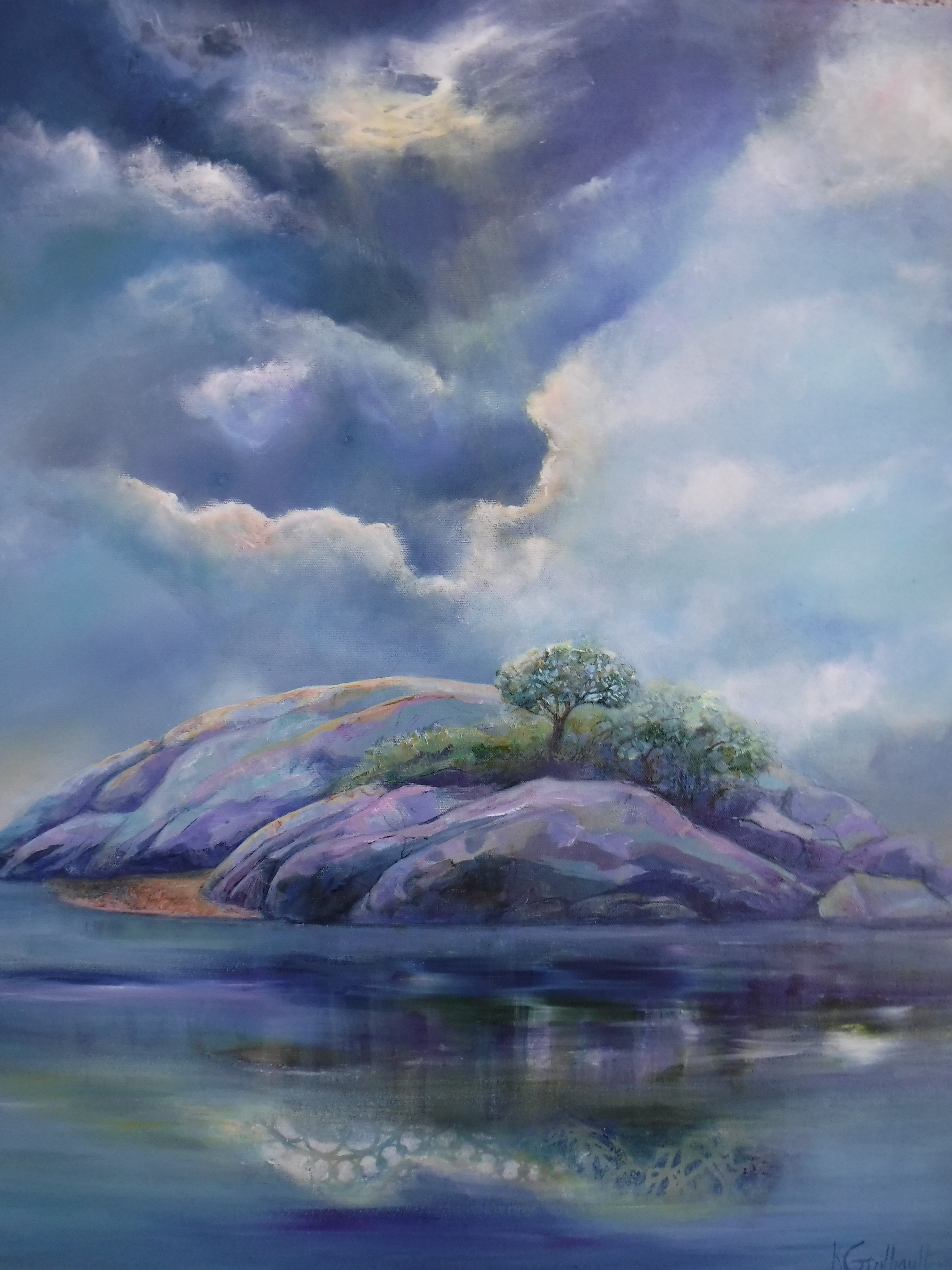
Improving a Painting with a Squeegee
December 20, 2021
I wanted to work on the water reflections beneath the Island in the painting.
In the first picture, I squeezed tube colours and white directly onto the canvas.
In picture 2, I dragged horizontally with an ordinary squeegee to spread out the paint.
In picture 3, I did some light brushstrokes to smooth the transitions. The result was a more realistic reflection that looked fresh, not overworked. The lattice-work reflections at the bottom of the paintings were done intentionally with a stencil, and are intended to create a dreamlike portrayal of the cloud reflections. I like to juxtapose fantasy and realism.
Abstract Background, November 3, 21
Pouring Technique, and how to create texture
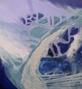
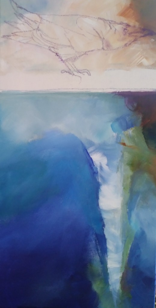
This was poured on a blue background using Flashe paints, and then used a palette knife to create a raised texture in one area 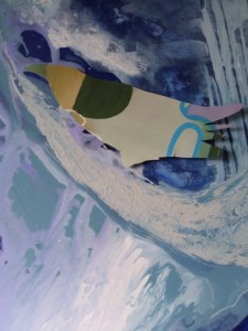
I “saw” a raven head in the dark area, so I made a raven template from cardboard, and taped it to the painting to figure out if that size would work
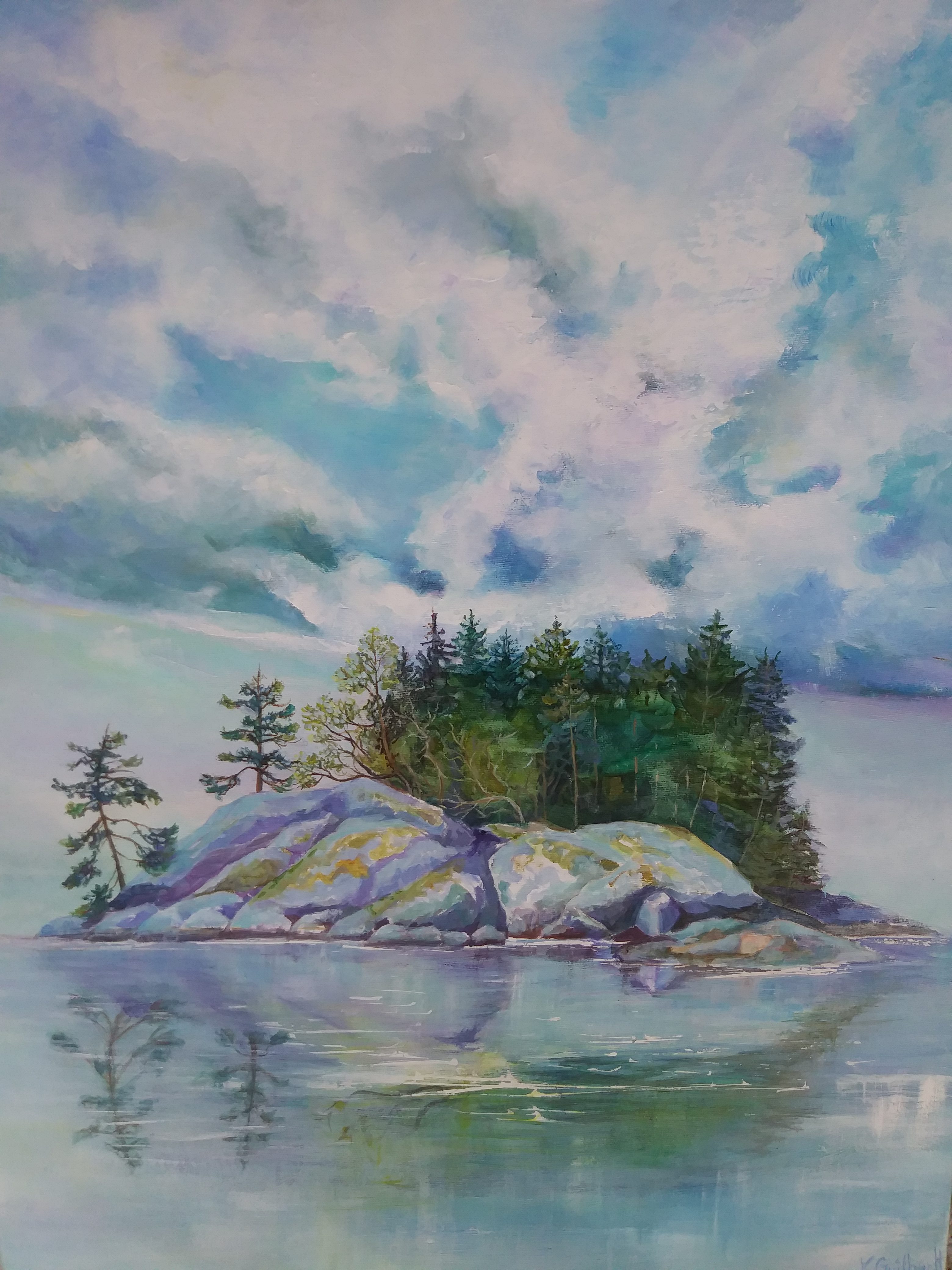
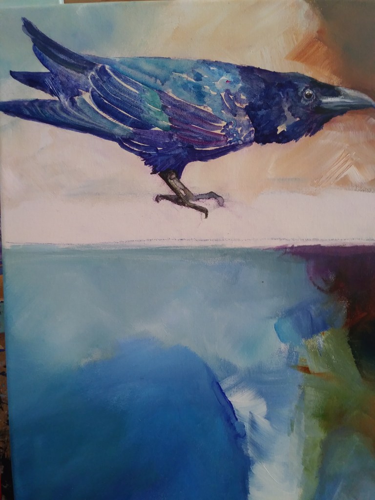
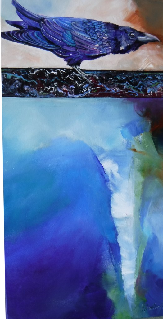
This is the finished painting, Raven and Mandala. I rotated the canvas, stared at it until I saw the head and body of a raven, which I developed. I left some of the light abstract markings on the bird, so that it would appear somewhat magical and abstract. I used a stencil to add the mandala pattern, and then subdued it by glazing over it, to make it blend in with the background.

Reclaimed Painting: gesso saves the day
I liked the sky and clouds of a failed beach painting, so I painted out the unwanted section with gesso. I would normally paint over a section with coloured paint, but the gesso seemed to restore the light-sharing properties of white canvas. I was still able to get transparent-looking water, even though there are colour layers under the latest gesso layer.
That was easier then taking the whole canvas off the stretcher frame and stapling on new canvas!

This shows the gessoed bottom half, with frisket applied to water highlights
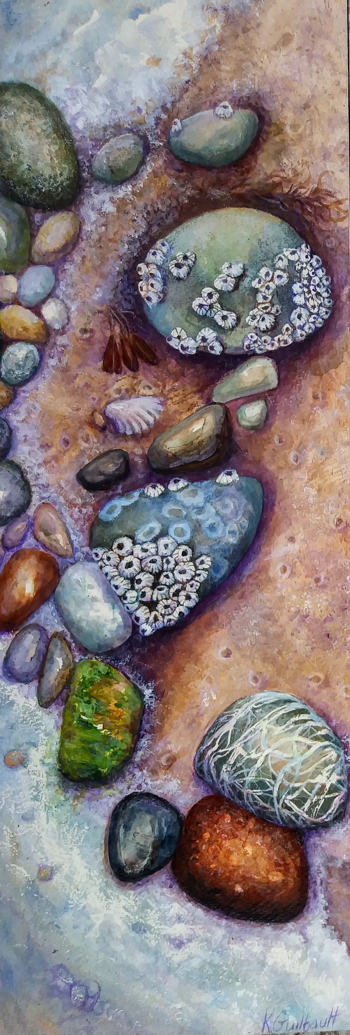
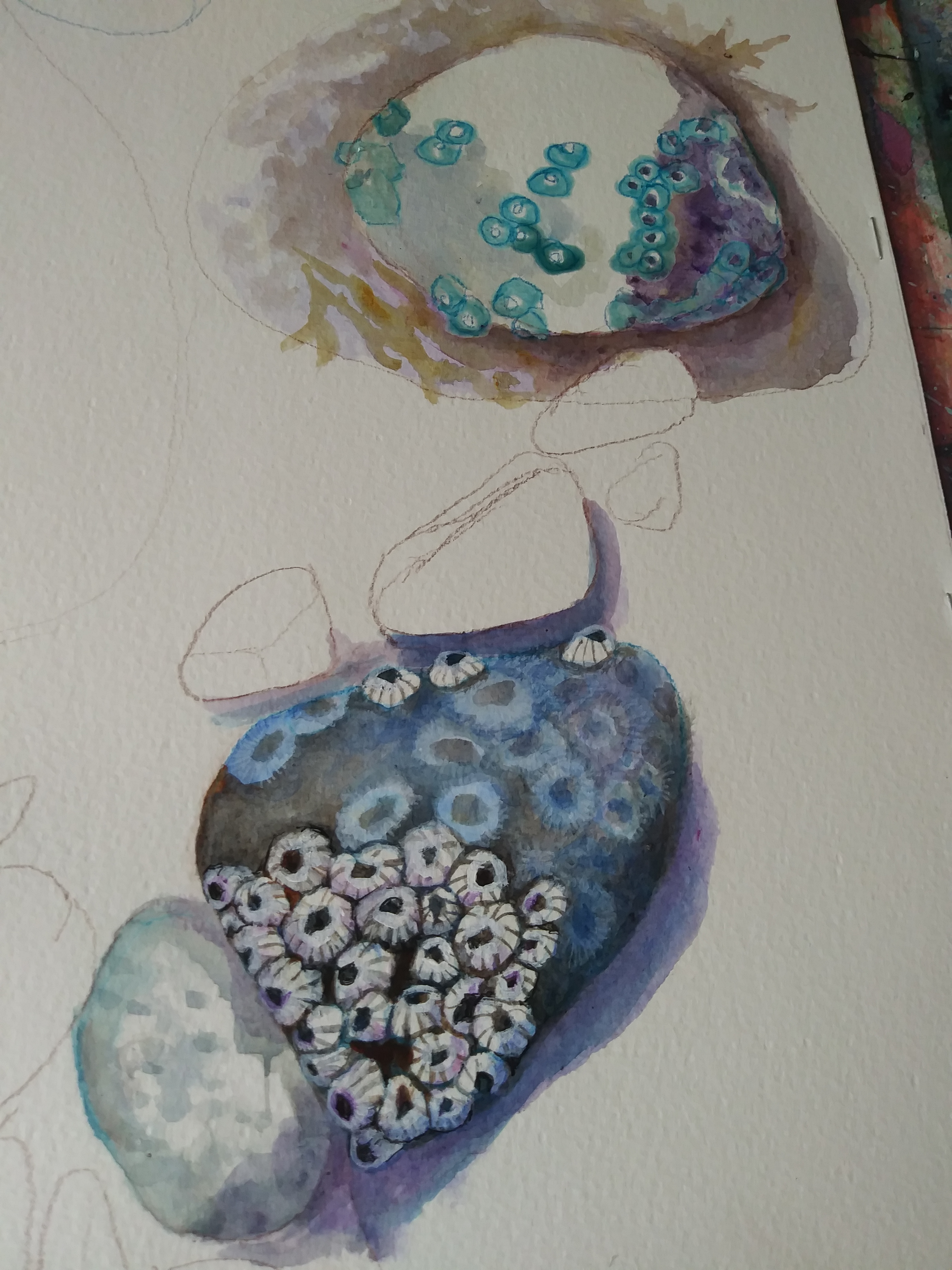
Barnacled Pebble Painting
April 2021- Acrylic on watercolour paper, mounted on cradled panel
This painting was inspired by a walk on Cadboro Bay Beach at low tide, where there were a number of rocks with barnacles in the sand. The composition was developed as I added rocks to the painting, with sea foam creating the triangular boundary at the left.
The sand was stippled with a toothbrush (spray) and a stiff paintbrush (larger dots).


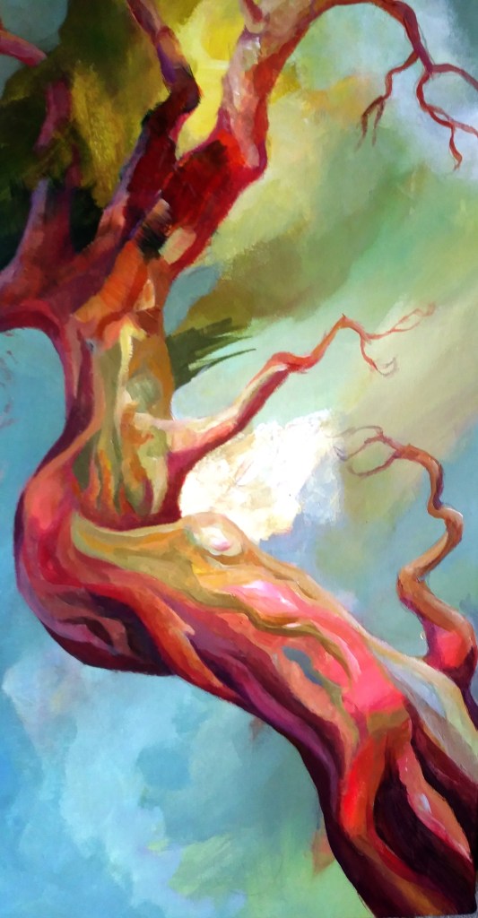
Abstract Arbutus, April 18, 2021
This painting began with an abstract underpainting, the background. Then I began to “see” an arbutus tree in the reddish areas. I found one of my photographs of an arbutus and began to develop the “volume” or solidness of the tree shape. I left the white splotch as it was, for a pop of contrast. see below for the underpainting.
This painting is 12×24 inches on stretched canvas.

Raven With Attitude
created December 2020
This painting is typical for me in that I began with an abstract background, applied with a brush, using heavy body acrylics and a little retarder, in order to move the paint over the whole area without it drying or creating unwanted hard edges.
I divided the canvas near the top, and added the Raven. I poured liquid acrylics to create the horizontal band under the Raven, taping off the areas above and below it to protect the rest of the canvas.
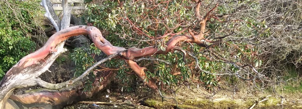
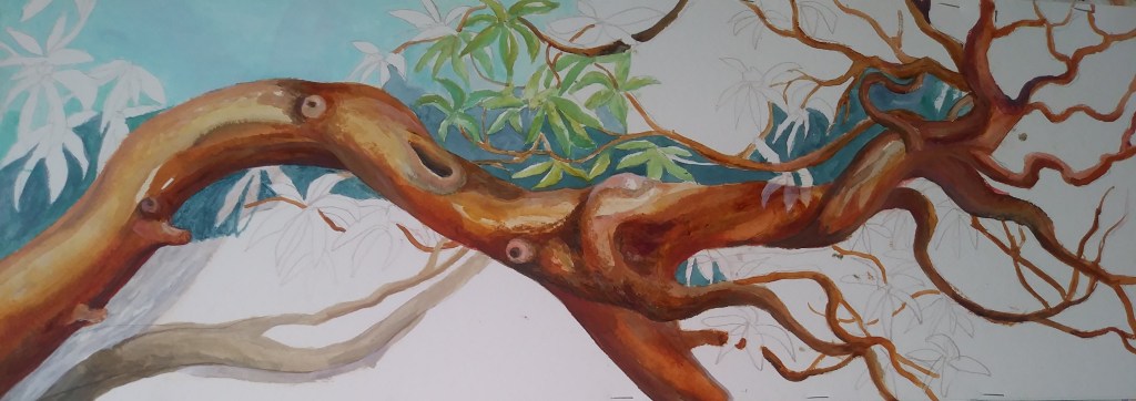
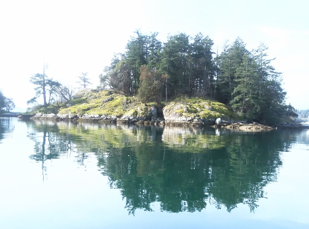
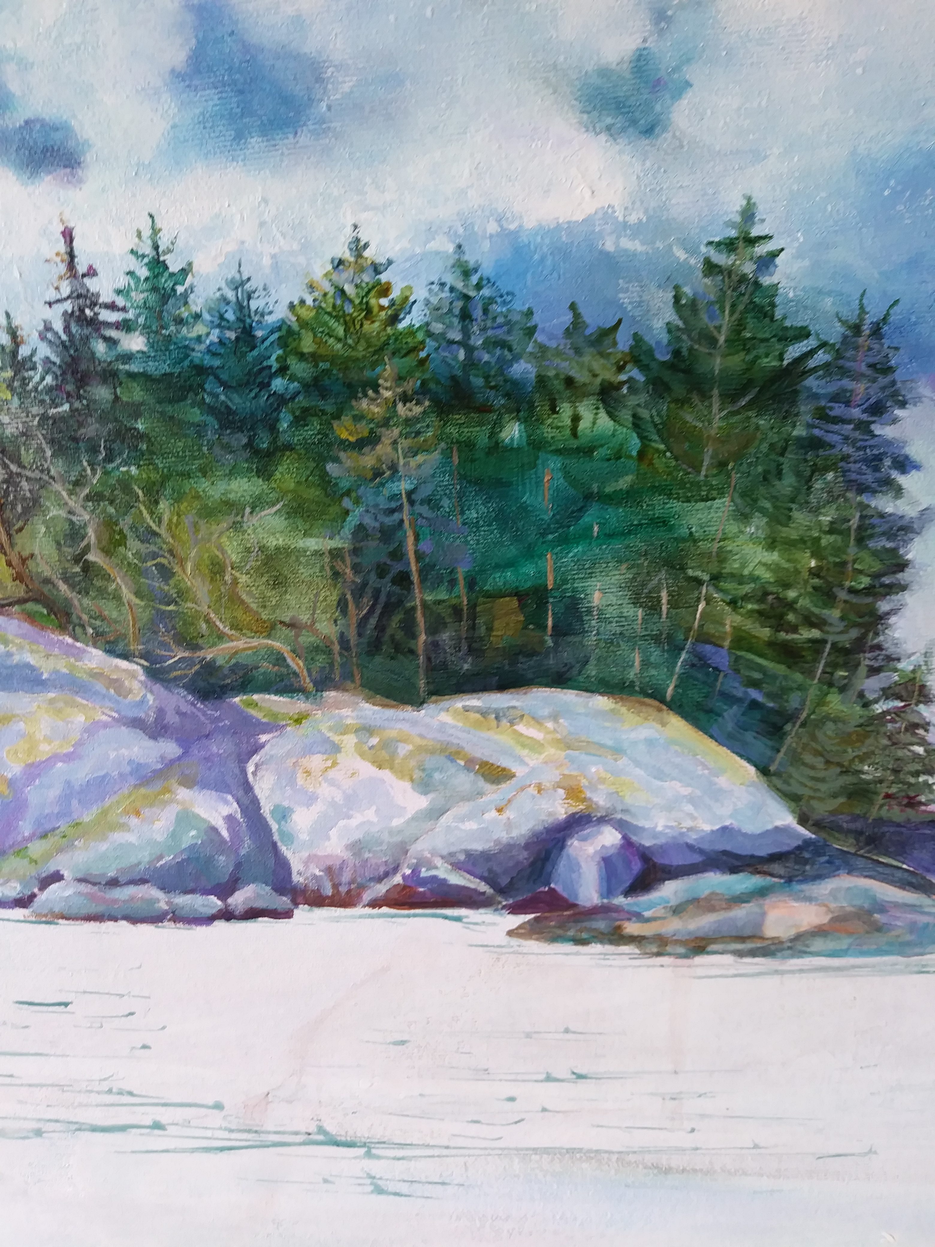
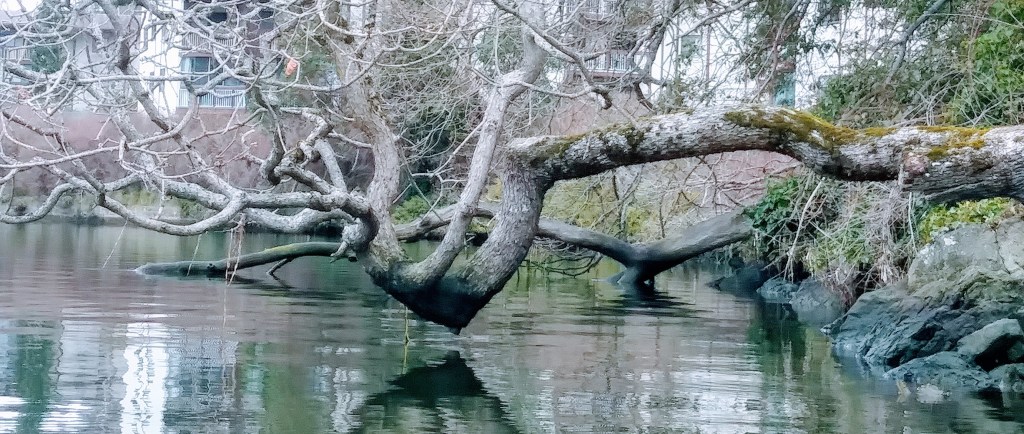
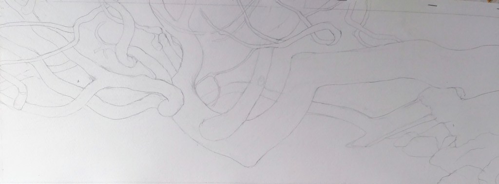
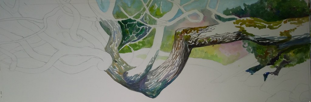
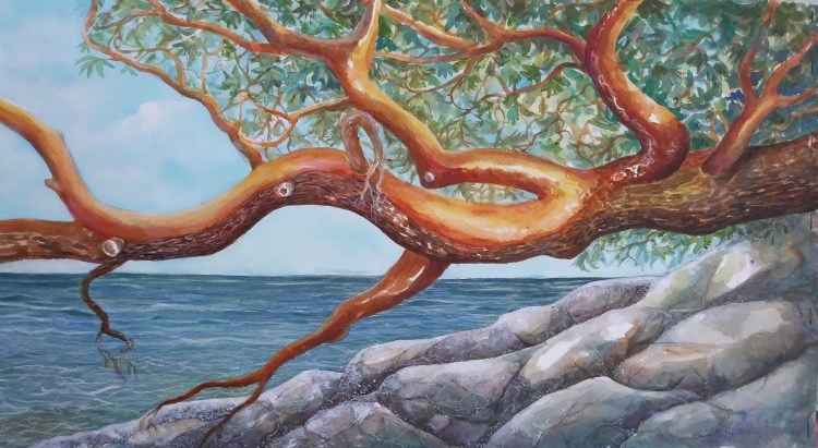
Oak Tree Over Water
March 24 2021

Arbutus Paintings
These are from photos I took of Victoria area arbutus trees, mostly overhanging over the ocean or the Gorge Inlet. They are acrylic on paper, with transparent layers like watercolour, built up until they are rich and varied.


reference picture
How I begin a painting